Last update December 18, 2024
I’ve always been more attracted to backend development. However, I’ve mainly worked as a full-stack developer, and working on the frontend used to be a nightmare. Especially working on the templating side. After years of trying to make the CSS work by typing some random values and observing effects, I decided to learn how it works and become better at it.
As I was also getting really into UX/UI theories, it only became logical to develop my skills in the field of frontend development. I still consider my skills very low in the matter, and I have a lot more to learn, but this article is for every backend developer out there trying to make CSS less of a hurdle: you can actually learn how-to-css, and your journey might be starting now (with mine)!
In this first article, I’ll cover CSS “classic” positioning, I won’t cover grid and flexbox (maybe if a later article, if I stick to my journey towards better and mastered CSS🤞).
I advise you create a dummy html page and make the manipulations and tests yourself, you’ll understand and remember more easily! A great way to train is to pick some web pages examples and try to reproduce their template yourself with your newly acquired skills in CSS.
TL;DR
This article covers the basics of CSS classic positioning, excluding grid and flexbox. It explains the behavior of the different position attribute in CSS. Key points include:
- Fixed Positioning: Elements stay fixed relative to the browser window, even when scrolling.
- Absolute Positioning: Elements are positioned relative to the nearest positioned ancestor or the document, and are removed from the document flow.
- Relative Positioning: Elements are positioned relative to their original position, retaining their space in the document flow.
- Floating: Elements are removed from the normal flow and pushed to the left or right.
- Z-index: Works with
relative,absolute, orfixedpositioning to control stacking order. - Top, bottom, left, right: Work with positions that are not static.
- Inherit: Allows to inherit position from “container”.
- How to center elements vertically and horizontally with CSS.
The article contains image and animated demonstrations and code snippets to reproduce it yourself.
What does the “position” attribute do in CSS?
The position attribute defines how an element in positioned in a document. In a normal flow (where elements default to position: static), html elements, or boxes, are placed sequentially, starting from the beginning of the document.
Fixed position
Fixed positioning fixes the position of an element relative to the browser window. The element always stays fixed, even when scrolling.
To demonstrate this, I created a green box without CSS styling (static), and a blue box with position: fixed and a bottom attribute. Otherwise, the blue box would be above the green one, the green one not or barely visible (see second demo).
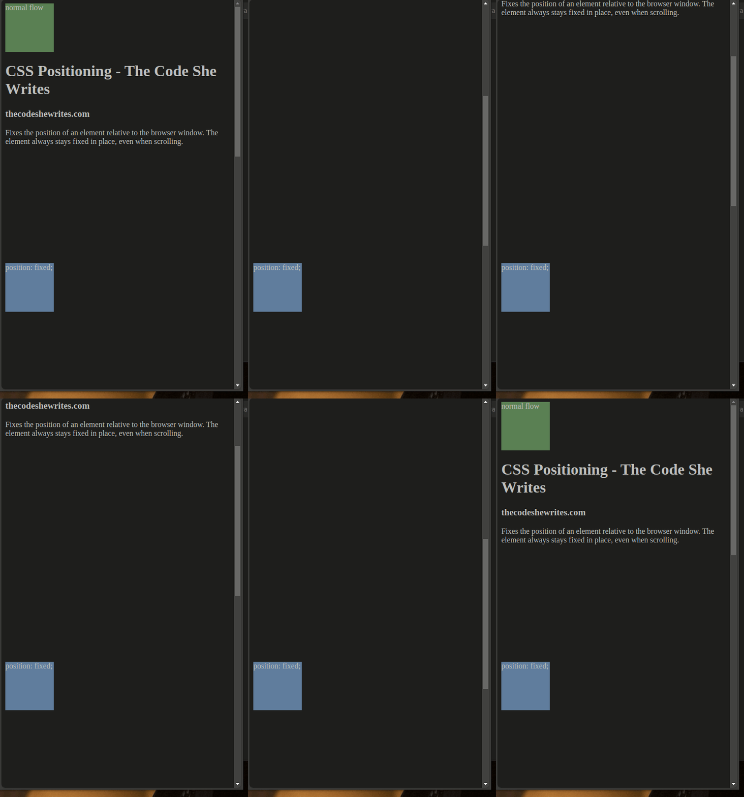
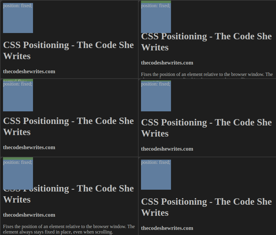
It is thus really important to understand that normal flow (static position) and position flow act as if they’re not aware of each other!
Top, bottom, right, left
Attributes “top”, “bottom”, “left” and “right” only work when applied on an element that has a position (not static). Those attributes on a static element will have no effect!
If using conflicting attributes (top and bottom, or right and left) in the same CSS class, only the first one will be taken into account.
Code snippets
Try it yourself! You can use below code if needed.
index.html file:

<!DOCTYPE html>
<html lang="en">
    <head>
        <title>CSS Positioning - The Code She Writes</title>
        <link href="styles/main.css" rel="stylesheet" type="text/css">
        <meta charset="utf-8">
    </head>
    <body>
        <div class="box blueBox">position: fixed;</div>
        <div class="box greenBox">normal flow</div>
        <h1>CSS Positioning - The Code She Writes</h1>
        <h3>thecodeshewrites.com</h3>
    </body>
</html>
main.css file:
body {
background-color: black;
color: white;
height: 2000px; // if one element is fixed outside of that space, it creates a scrollbar
}
a {
color: grey;
}
.box {
width: 100px;
height: 100px;
}
.blueBox {
background: DarkCyan;
position: fixed;
top: 150px;
//bottom: 150px;
}
.greenBox {
background: DarkSeaGreen;
color: black;
}Absolute position
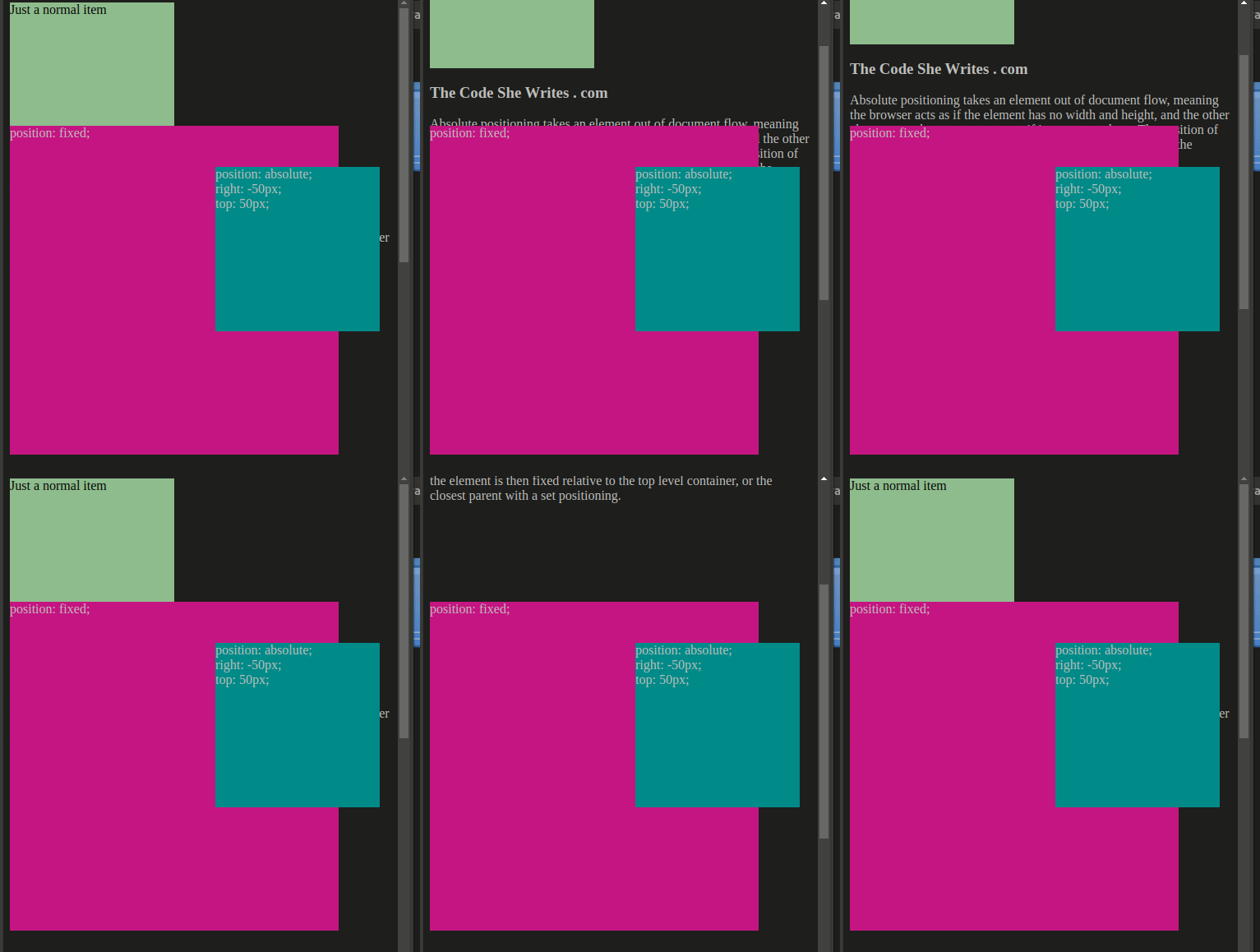
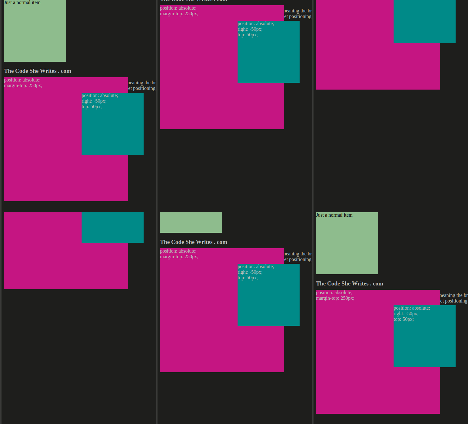
An element with absolute positioning is fixed relative to the top-level container (the document), or the closest container with positioning.
It’s also removed from the document flow: there is no space reservation for it. The element has its own layer on top of the document flow. It’s kind of “floating”. Other elements are not aware of it.
If it’s inside another element that has a position, attributes like “left”, “top”… will set the element relative to the borders of the container. Otherwise, the container is the document itself.
Absolute positioned elements follow scrolling, they’re not fixed on the screen, except if the container is fixed.
Code snippets
Try it with and without the container div to compare behavior.
    <body>
        <div class="container">
            <div class="box blueBox"></div>
        </div>
        <div class="box greenBox">Just a normal item</div>
		<h3>The Code She Writes . com</h3>
    </body>
.blueBox {
background: DarkCyan;
position: absolute;
right: -50px; // position relative to the container
top: 50px; // position relative to the container
}
.greenBox {
background: DarkSeaGreen;
color: black;
}
.container {
background: MediumVioletRed;
height: 400px;
width: 400px;
margin-top: 250px; // position of the container relative to the document
position: absolute; // play with different values to observe the behavior (relative, fixed,...)
}
Relative position
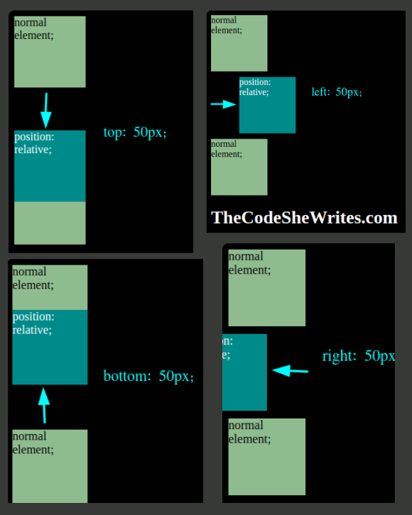
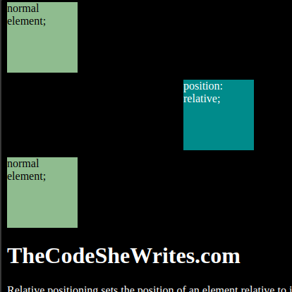
A relative position sets the position relative to the original position of the element.
The element is retained in the document flow: its original position, together with width and height, are retained, and other elements behave as if it was still in its original position.
If the element is inside a container, it positions relative to its original position inside that other element.
Attributes “top”, “bottom”, “left”, “right” will push away the element of the mentioned distance from that point. For example, top: 50px will push the element 50px from the initial upper border, meaning it’ll push it to the bottom.
Floating
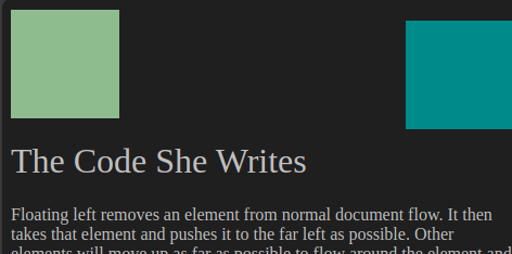
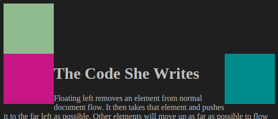
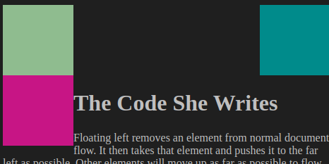
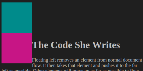
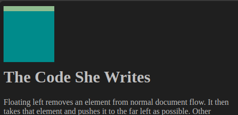
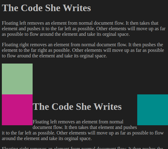
Setting the “float” attribute will remove the element from the normal document flow and push it as far left or right as possible. The original position is not retained, meaning other elements in the same document flow may “take” the original position if they fit.
Code snippets
Play with the elements by changing the floating and by changing the order of the div tags. Elements after the floating ones, in the same flow, will try to fit around them.
    <body>
        <h1>The Code She Writes</h1>
        <p>Trying to understand floating elements in CSS!</p>

		<div class="box greenBox"></div>
        <div class="box blueBox"></div>
		<div class="box pinkBox"></div>

        <h1>The Code She Writes</h1>
        <p>Still trying to understand!</p>
    </body>
.box {
width: 100px;
height: 100px;
//margin: 10px;
}
.blueBox {
background: DarkCyan;
float: right;
}
.pinkBox {
background: MediumVioletRed;
float: left;
}
.greenBox {
background: DarkSeaGreen;
}Inherit
The position attribute can take the value “inherit” to use the same positioning as the container.
Z-index
Z-index only works on elements with position attributes “relative”, “absolute” or “fixed”.
How to center an element both horizontally and vertically
Try it yourself applying notions we learned in this article.
General logic to apply
In order to position an HTML element in the center of a page:
- create a container that will center vertically
- center the element horizontally inside that container
Detailed step-by-step implementation
- Create a container.
- Choose a position that will set it outside of the normal document flow and will allow to position relative to the viewport (the browser page).
- Position the container in the middle of the page, relative to the top of the page.
- The container’s top border is now exactly in the middle of the page, change one of its properties to move it up of half its height (not a position property).
- Create an element inside the container.
- Set it in the center horizontally by defining equal left and right margins.
The code to center an element vertically and horizontally in the page
    <body>
        <div class="container">
            <div class="box blueBox"></div>
        </div>
        <h1>TheCodeSheWrites.com</h1>
        <p>Positioning an HTML element in the center of a page horizontally and vertically.</p>
    </body>
body {
background-color: black;
color: white;
height: 1000px;
}
.box {
width: 100px;
height: 100px;
}
.blueBox {
background: DarkCyan;
margin: 0 auto;
/* center an element in its container, given the container has a width (here, 100%) = put an equal amount of margin left and right; 0 = top margin (not useful here), auto = left & right;
*/
}
.container {
background: MediumVioletRed; /* remove the background color when you're done testing*/
position: absolute; /* take the container outside of the normal document flow and position it relative to its nearest ancestor (container or viewport) */
top: 50%; /* position at 50% of the top of the viewport (= the container's container) => the top border of our container is now exactly at the middle of the viewport */
margin-top: -50px; /* minus half its own height */
left: 0;
width: 100%;
}
