
Last update December 18, 2024
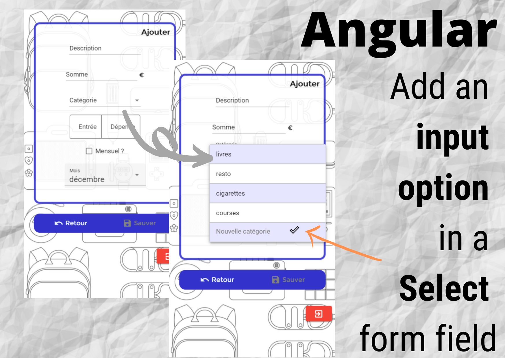
In this article, I will explain how I implemented an free-text input field as an option in a dropdown list with Angular, Material UI and Reactive forms. I chose to add my input field directly inside the dropdown list, at the end of the proposed options.
I won’t go through the whole creation of a Reactive Form but straight to the addition of an input field in the select box, as an option.
This post was written based on an application developed in Angular 10. Some problems mentioned here have been fixed in newer versions.
Adding an input field as an option in an Angular Material select box
The first step was to know where to place that input element in the whole Mat form hierarchy. Adding an input field in a dropdown list is not a very usual practice, so I had to DIY and use some tricks to achieve the result I wanted.
In the Mat form field, I created a dropdown list with Mat select. I iterate over a list of options to dynamically create my list.
My input field comes as another option, just as you would do to create a default, hardcoded option (see code in orange).
I had to put my whole input field in a Mat form field inside the Mat option, otherwise it wouldn’t work as expected.
I used label for the input (using Mat label instead of a placeholder allows for more customization, as we’ll see later). I used a Mat input field for my text input and I added a Mat icon as a button to validate my input.
<form [formGroup]="form">

<!-- the input fields were omitted for brevity -->

  <mat-form-field>
    <mat-label>{{categoryLabel}}</mat-label>
    <mat-select formControlName="category">
      <mat-option *ngFor="let category of categories" [value]="category">
        {{category.name}}
      </mat-option>
      <mat-option>
        <mat-form-field>
          <mat-label>Nouvelle catégorie</mat-label>
          <input matInput type="text">
          <mat-icon matSuffix>done_outline</mat-icon>
        </mat-form-field>
      </mat-option>
    </mat-select>
  </mat-form-field>

<!-- the toggle, checkbox and simple dropdown fields were omitted for brevity -->
</form>
That’s the basis, but if you try it as-is you’ll see it’s a bit messy. Also, so far, we’re not doing anything with our input.
Preventing the list from closing on input
Now we have to do some customisation to adapt to our custom select box.
Natively, if you click an option in a select dropdown list, the element gets selected and the list closes automatically. This is of course annoying in our case, because if we click the input field we don’t want the list to close, we want to be able to write in it and validate the input, then the list should close.
To achieve this, I put a handle “addOption” on the Mat option containing the input field. Thanks to this handle, I can access properties such as “disabled” and set its value to false. When I click on the select box, it disables that Mat option.
Concretely, it means that when I click that Mat option, it doesn’t get selected, so it doesn’t trigger the closing of the list. But I don’t want my list to stay open for ever, so when I click on the Mat icon to save my input, I reset the disabled property to false.
In my case, I only allow user to input one option per form, so if you’d like to let your user add multiple values in the select box you should change a bit that part of the logic.
Saving the new option
Then, I worked on the save logic. If the user inputs a custom option, that option is set as an attribute of the object I’ll pass to my back-end for saving in database. I added a click event on my icon, calling a method that passes my input field as an HTMLInputElement. I do that by using a handle “newCat” on my input field.
Now let’s look at the TypeScript file.
  <mat-form-field>
    <mat-label>{{categoryLabel}}</mat-label>
    <mat-select formControlName="category" (click)="addOption.disabled = true">
      <mat-option *ngFor="let category of categories" [value]="category">
        {{category.name}}
      </mat-option>
      <mat-option #addOption>
        <mat-form-field>
          <mat-label>Nouvelle catégorie</mat-label>
          <input matInput #newCat type="text">
          <mat-icon(click)="addCategory(newCat); addOption.disabled = false;" matSuffix>done_outline</mat-icon>
        </mat-form-field>
      </mat-option>
    </mat-select>
  </mat-form-field>
This is my addCategory method with its HTMLInputElement parameter. In order to get the actual value that was input in my input field, I’ll use the property “value”. But be aware that an HTMLInputElement holds a lot of useful information and handlers, console.log it to see it all!
Here the logic implemented to save the input in database:
- if the user chooses an element in the dropdown list, I get the object and use its ID (that already exists in my database)
- if my user inputs a new option, I will send the input text with my DTO in order to create a new object with a new ID in database.
In my code, I have a newCat attribute of type string to which I assign the input value (when there is one). I assign that same value to a field categoryLabel which allows me to display the category as label of the placeholder. Finally, I add a control to my form with the input value so it will be sent with the other information to my back-end server when I make a post or put request.
addCategory(newCat: HTMLInputElement) {
  this.newCat = newCat.value;
  this.categoryLabel = newCat.value;
  this.form.setControl('category', new FormControl(this.newCat));
}
A bit of styling to hide the DIY…
I made a background that differs for even or odd line numbers. I used CSS binding to achieve this. I just had to set a conditional styling based on the fact that the index is even or odd. For my additional option, I only need to check if the length of the previously iterated-over list is even or odd.
I set the Mat form field appearance to “none” so it doesn’t draw a line under the input field.
I made the label disappear as soon as the input field is clicked. The natural behavior of the label is to appear as a superscript when the field is clicked, but it didn’t make sense here. I didn’t manage to find a built-in event that would allow me to cancel the label automatically, so I set the size of the text of the label to 0 (with CSS binding on the Mat label). To do so, I created an attribute “hiddenLabel = false” in the TypeScript file, and I just set it to true when the input field was clicked.
My label doesn’t reappear if I delete the whole text of my input field, because I didn’t code the backward way, but it would be easy to do so.
  <mat-form-field>
    <mat-label>{{categoryLabel}}</mat-label>
    <mat-select formControlName="category" (click)="addOption.disabled = true">
      <mat-option [style.background-color]="i % 2 == 0 ? '#e6e6ff' : ''" class="categoryOption" *ngFor="let category of categories, let i = index" [value]="category">
        {{category.name}}
      </mat-option>
      <mat-option [style.background-color]="categories.length % 2 == 0 ? '#e6e6ff' : ''" class="categoryOption" #addOption>
        <mat-form-field appearance="none">
          <mat-label style="color: grey;" [style.font-size]="hiddenLabel ? 0 : 12">Nouvelle catégorie</mat-label>
          <input matInput #newCat (click)="hiddenLabel = true" type="text">
          <mat-icon style="color: black" (click)="addCategory(newCat); addOption.disabled = false;" matSuffix>done_outline</mat-icon>
        </mat-form-field>
      </mat-option>
    </mat-select>
  </mat-form-field>