As a developer, I like to point out that I’m not a designer. Thinking about the look and feel of the apps (either web, desktop or mobile) I code always seemed like the less interesting point for me.
The funny thing is that, because I’m a woman, every time I join a new team, coworkers think I’ll be the one to make the design better.
The aesthetic of the app was always my last concern. Don’t get me wrong, I was actually trying to make something OK in terms of UI, but I never dug any further and was content with the bare minimum. I recently understood the reasons, and made a step forward to design better UIs and put some effort in the UX.
I hate CSS (says every back-end developer)
Let’s face it: CSS is not easy. If you compare to how easy it is to learn and use HTML, CSS is really tough. I think most of us just assume that CSS shouldn’t take too much time. Therefor, we never actually take the time to learn it properly.
And we keep on trying random values until it seems ok. Then someone resizes the page and it’s chaos. And we hate it even more.
I’ve recently changed my mind and my way of tackling CSS. CSS is a language, and it’s worth learning as much as any other one in your development stack.
CSS might seem a bit random and untamable, but the good news is it’s just a series of grammar, vocabulary and hierarchy rules, as in any other coding language. You can make sense of it, learn it, become better at it, even master it. When you see it as one of the tools in your stack, it becomes more interesting and engaging.
You can look for good, comprehensive only courses on the web, train on CSS Battle (not tested yet), or challenge yourself just by designing your app on paper and implementing it with HTML and CSS. I also totally recommend the e-zine “Hell yes CSS!” that’s teaching CSS in a really visual manner and covers a lot.
I wrote this zine because, for most of the last 15 years, I found CSS confusing and upsetting (not “hell yes!” at all!). Even CSS changes that I felt like should be “simple” would take forever, and I was often just changing random things and copying and pasting from Stack Overflow. At the end I usually didn’t understand exactly why my CSS code worked, and it wasn’t a good feeling.
Julia Evans, Hell yes CSS!
UI is not only a thing for designers
I often thought that my apps didn’t look terrific because I’m not a graphic designer, I can’t use tools like Photoshop and create beautiful pictures to decorate my website or my app. It wasn’t my fault then! I was pretty wrong, because you can make a full mobile app without a single picture.
UI for a developer is about HTML and CSS. That’s something we can totally learn and implement, and there’s just enough possibilities with these two to design an app without graphic design skills.

UX/UI isn’t a swear word
UX has been all over the place for a few years now. At some point I thought that, maybe, it was worth having a look at it, and at least know what all the fuss is about. And I found out UX is really interesting (side note from the future: a few years later, although I’m still not a fan of implementing UI myself, I’m very much passionate about the whole UX process).
Instead of seeing it like an unwanted task, I switched my mind to seeing it as a problem to solve. And you know what? Solving problems, finding and providing solutions, is one of the main reasons I love coding!
UX design is a really broad discipline that includes UI but also a lot more, with the goal of providing efficient and useful solutions for the target (the end-user). It’s super interesting, especially for someone like me who used to work a lot with customers and worked experience in marketing before starting working in IT. I found a lot of connections between my background and previous experience, and UX design problem solving.
At some point I realized and accepted the importance of the graphic interface. An application can be incredibly innovative, work flawlessly, and have beautiful code in the backend, if it doesn’t answer the target’s need and is not usable by the end-users, it will all be for nothing. And I personally hate doing things for nothing, even when I’m paid for it.
So now that (I hope) I convinced you that UX/UI were not a drudgery but just one more aspect of software engineering, I’ll tell you how I put in practice some of the concepts I’ve learned about UX thanks to online courses and articles.
My case study: designing a user friendly mobile app
I had published a mobile app. It was nothing incredible but it allowed me to play with some new tools and take a little personal challenge, as I was starting my career in software development.
A friend of mine gave some harsh comments about it on a UX/UI point of view. My perfectionist self was pretty upset. Especially because it wasn’t the first time someone was telling one of my apps wasn’t sexy, while I was personally really content that it worked flawlessly and had no bugs (and no one was acknowledging it!).
You have to admit, as a backend oriented developer, it’s always hard to hear so much criticism about the design while no one seems to be aware of the invisible work that makes it work and work well.
I guess this will be our burden until the last line of code we write.
I used to say that I don’t care about design, but a the same time I don’t enjoy (I hate) receiving criticism. In the end, it motivated me to put a big effort in the look & feel of the new app I was working on. I started learning about UX/UI to improve, and more importantly, I implemented it as soon as I had the opportunity.
Some important ideas about UX
Here are the notes I made while seeking information on UX, and what it meant for my project.
User Interface
UI is of course a big part of the UX design. It’s about the screens but also the material you use to interact with it (it may be a mouse, keyboard, touch screen…), the commands that can be used to interact (human computer interactions)…
For a mobile app, the most important part is to have mobile oriented actions (Angular does that already, and you can add Ionic if you want extra mobile functionalities. I love this framework!).
For the screens, here are some examples of principles that should be observed:
- Space must be well balanced: not too much empty spaces but not too much information on the screen. Elements that are far away from each other are considered as “separated” and not having a connection by our brain, while we make connections between those that are close to each other.
User Research
UX is not only about design and look and feel. The end goal of UX is to make sure your product is USABLE (that’s mostly UI but not limited to the visual dimension) and USEFUL, meaning it fulfils a need. To achieve that, you’ll need to make interviews, think about Personas who could use your app, inspect the market…
To tailor an application, you need to know its target audience. What’s their behavior, their concrete needs, their motivation?
The app must also be USABLE, otherwise even the greatest idea will go to waste. The user has to find information easily, the actions have to be clear, the labels and words have to be understandable at a glance, you should reduce the number of clicks to achieve regularly needed actions, work on the error catching and error messages clarity… This one is really important and the developer can actively participate in the process at this point.
In UX design, there’s a lot about accessibility too. Another topic that I really like and that should be taken into account by all development teams. Accessibility can be about the way people interact with the app (visually or physically), the way information is presented to fit all learning styles…
User feedback
UX relies on an iterative process where we gather information from the users, as much as possible, but also give them intermediate versions to play with. Thanks to those early tests, we can adjust the direction before going too far in the wrong direction. Design Thinking is a good way to tackle this challenge.
Don’t reinvent the wheel
You’ve probably heard that sentence a lot. I really like making things by myself and creating, I truly believe that this is part of the learning process, and that gives me more satisfaction than copy/pasting or using existing tools (I want to write code!).
However, I came to the conclusion that, as UI is my weakest point, I should be humble enough to start by looking at what already exists and is recognized as valid, base my designs on it, and maybe later when I’m a Queen of UI I can create my own recipes.
Therefor, I gathered visuals and ideas, by researching the Internet and by opening my favorite apps and analyzing the recurring graphical codes of mobile UI.
I discovered some trends (“ok, rounded angles are a thing”, “ok, small groups of actions delimited”, “color palettes can be this way or that way…”, “ow I see, no one shows the title of the app after logging in”… but also “everybody’s doing purple so I don’t want purple #rebel”).
And… I played. I spent a lot of time choosing a color palette, but I guess that’s something you learn with the time. (Edit: color palettes are still driving me nuts after more than 5 years of applications development… some websites like Color Combos propose premade color schemes to choose from)
Angular, Material and CSS
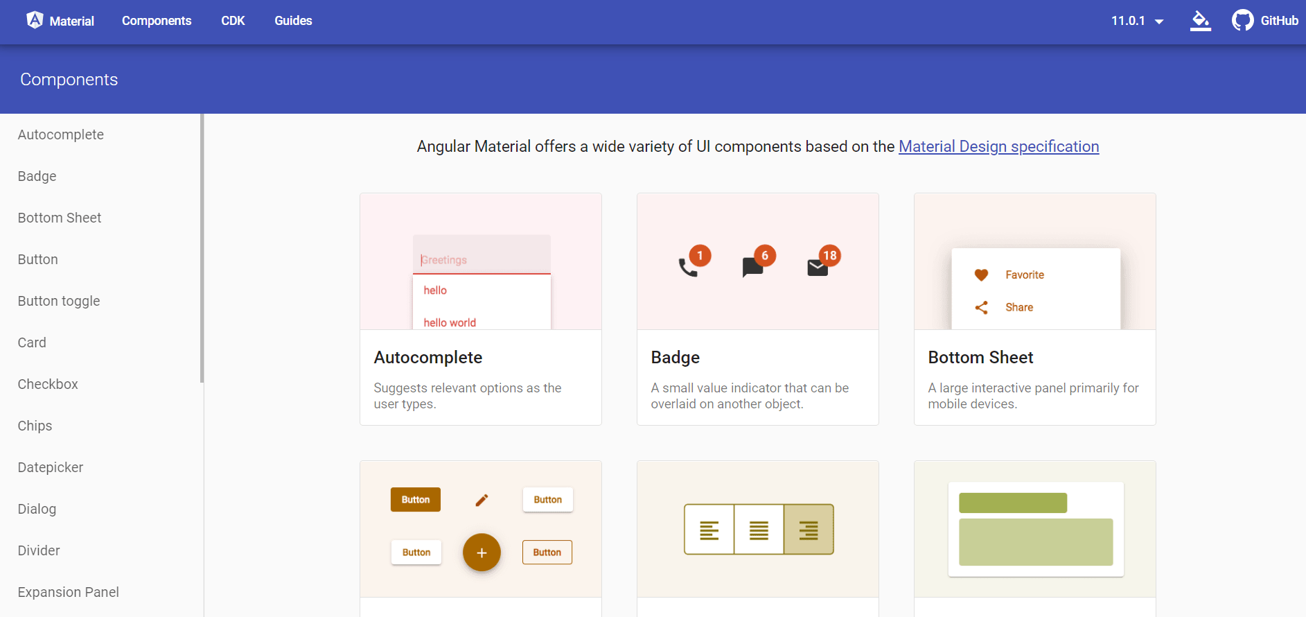
For my app, I used my signature stack, a REST API made with Java/Spring Boot and a front-end with Angular. I always use the Material UI library, they have a ton of elements, good documentation, great integration with Angular.

Even when using Material, there always comes a point where I need to put my hands in the CSS for customization.
I was about to discover that the Material elements have TONS of CSS handlers to play with, to completely customize them. And I loved it. I simply used the inspector of Chrome browser, where you can see every single property of an element, the ones that are inherited, the ones that are overridden.
Concretely, my UI became a real “coding problem solving”, it was amazing.

Sneak peak at my app
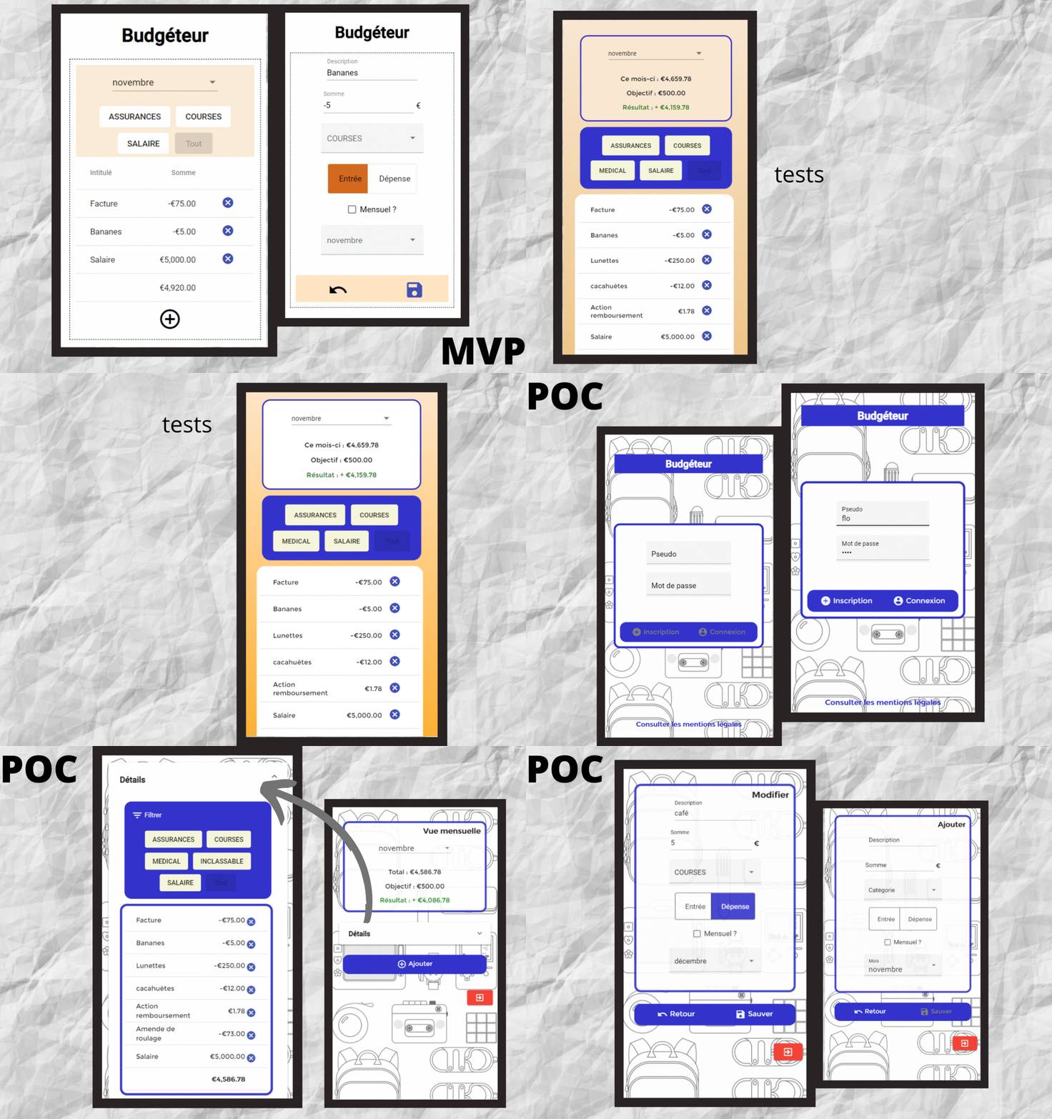
Here’s my app, before and during tests, and the final version. So far I’m pretty happy already with the evolution.
I’ve made a real work on CSS, I’ve used more Material elements than ever while in the beginning I was pretty reluctant to using third-party elements, and I think my app is really clear to understand.
Now, I just have to hand it to my beta-tester for a first review and based of their comments, up to the next improvements! (That’s also part of the UX process!)

A step further: I wrote my graduation work about UX/UI design!
I was still attending evening classes to get my bachelor degree in business informatics while learning about UX design on my free time. I chose to study it, develop a project lead by its principles and write my graduation work about it, as a challenge. It was a great opportunity to learn a lot about UX (way more than the few ideas I shared in this post) and to play with Material and CSS on a real-life project.
If you have such an opportunity, I would totally recommend going out of your comfort zone and exploring a topic you’re not familiar with or you wish to learn. It’ll bring you a lot and will generally be praised by the people reviewing your work 🙌.


2 thoughts on “A journey towards better designed apps: UX/UI isn’t that painful after all”