
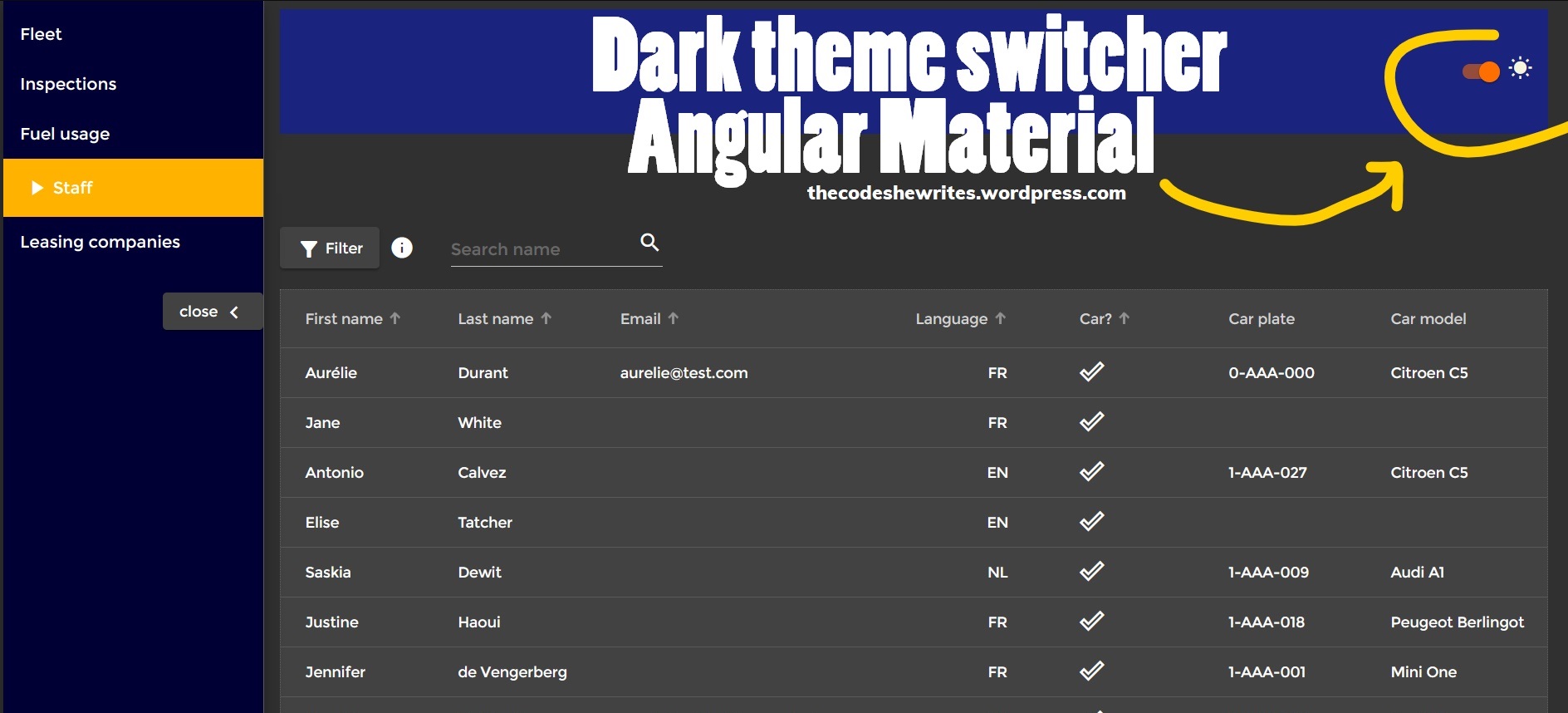
For my graduation work of Bachelor degree in Computer Science, I chose to focus and put extra effort on UX/UI, because it used to be something I hated and really sucked at. One of the goals UI-wise was to implement a dark theme switcher to my web app. Although theme management is pretty good implemented in Angular Material, I faced some issues which I’ll also share here (with the solutions I found).
Theme management with Angular Material
Here is the basic code for defining light (default, usually) and dark themes. This code is in the styles.scss file, at the very bottom. I’m not going through the setup of Material in an Angular project and the basic explanations about theming so we dive directly into the dark theme question. The documentation for basics is pretty good on the Material website.
Here “fleet” refers to the name of my application, it would be something else for you. I used the option “custom theme” when installing Material on my project, hence the structure of my that code (auto-generated) which slightly differs from the one shown on the Material website.
// Custom Theming for Angular Material
// For more information: https://material.angular.io/guide/theming
@import '~@angular/material/theming';
@include mat-core();
// Define default light theme
$fleet-light-primary: mat-palette($mat-indigo);
$fleet-light-accent: mat-palette($mat-amber);
$fleet-light-warn: mat-palette($mat-deep-orange);
$fleet-light-theme: mat-light-theme($fleet-light-primary, $fleet-light-accent, $fleet-light-warn);


// Define a dark theme
$fleet-dark-primary: mat-palette($mat-blue-grey);
$fleet-dark-accent:  mat-palette($mat-amber, 900);
$fleet-dark-warn:    mat-palette($mat-deep-orange);
$fleet-dark-theme:   mat-dark-theme($fleet-dark-primary, $fleet-dark-accent, $fleet-dark-warn);
@include angular-material-theme($fleet-light-theme);
This code so far defines both light and dark theme, but light theme is used by default.
Creating the button to switch themes
There are several ways to handle the theme switch, here is how I did. I chose to use a Material “slide toggle”. Unnecessary parts of the code have been removed for brevity.
First, my app has a component “header”, which is a child of my “app”. The template of my app has a tag to display the app-header and an event binding:
//app.component.html

<mat-sidenav-container>
  <mat-sidenav
    #sidenav
    fixedInViewport
    mode='side'
    opened
    class="side-navbar"
    >
  <!--  Side nav inside content:  -->
    <app-side-nav [sidenavHandle]=sidenav></app-side-nav>
  </mat-sidenav>
  <mat-sidenav-content>
  <!--  Main content of the page:  -->
    <app-header [sidenavHandle]=sidenav (darkThemeOn)="getDarkThemeOn($event)"></app-header>
    <router-outlet></router-outlet>
  </mat-sidenav-content>
</mat-sidenav-container>
A toggle to switch from light to dark theme
In my header component, I chose to use a toggle to switch from light to dark theme, and the other way around.
//header.component.html
<section>

  // some code

  <div class="light-dark-side-placeholder">
    <mat-slide-toggle
      #lightDarkToggle
      class="toggle-light-dark-theme"
      (click)="doToggleLightDark(lightDarkToggle)">
      <mat-icon>{{lightDarkToggleIcon}}</mat-icon>
    </mat-slide-toggle>
  </div>

</section>
This is not the main point of this article, but still a bit of explanation (the Material documentation is pretty solid): the toggle has a handler (#lightDarkToggle) to retrieve its full state, which I pass to a click event. I also added a mat icon which changes at each click: when the app is in light theme, the icon is a moon (suggesting toggle will switch to dark/night mode), and a sun when it’s in dark theme.
Here’s the logic to show the right icon:
//header.component.ts

export class HeaderComponent implements OnInit {
  @Input() sidenavHandle: MatSidenav;
  public title = 'Fleet Management';
  private darkThemeIcon = 'nightlight_round';
  private lightThemeIcon = 'wb_sunny';
  public lightDarkToggleIcon = this.darkThemeIcon;

  constructor() { }

  ngOnInit() {
  }

  public doToggleLightDark(toggle: MatSlideToggle) {
    this.lightDarkToggleIcon = toggle.checked ?  this.darkThemeIcon : this.lightThemeIcon;
  }
}
I store the name of the mat icon in variables (so I can use template binding, thus change dynamically). By default, I choose to display my app in light theme, thus show the icon suggesting dark theme next to the toggle, so I instantiate a variable holding the icon with the darkThemeIcon.
The MatSlideToggle object I retrieved from the template has a “checked” property which returns a boolean.
Then I add the logic to emit the state of the toggle to the app component, which will deal with it:
export class HeaderComponent implements OnInit {
  @Input() sidenavHandle: MatSidenav;
  public title = 'Fleet Management';
  private darkThemeIcon = 'nightlight_round';
  private lightThemeIcon = 'wb_sunny';
  public lightDarkToggleIcon = this.darkThemeIcon;
  @Output() darkThemeOn: EventEmitter<boolean> = new EventEmitter<boolean>();

// ...

  public doToggleLightDark(toggle: MatSlideToggle) {
    this.lightDarkToggleIcon = toggle.checked ?  this.darkThemeIcon : this.lightThemeIcon;
    this.darkThemeOn.emit(!toggle.checked);
  }
}
This is simply to communicate from child to parent component, you might not need this step if your toggle (or any other mechanism to show dark theme) is in the app component.
Note that the toggle is by default set to checked, so when I click it it’s !checked. Therefore, I negate the checked status when I emit to the parent because it seems more logical to me to do something if true…
Applying the dark theme to the application
Ok now it’s show time! First, let’s make the simple, basic implementation, maybe it’ll work for you without any other adjustment. After, I’ll go through the problems I experienced.
First, in the styles.scss, we have to create classes for our dark and light theme. This is the first version I used (I had to change afterwards, but depending on your app structure it might work as is):
.dark-theme {
  @include angular-material-theme($fleet-dark-theme);
}

.light-theme {
  @include angular-material-theme($fleet-light-theme);
}
Then we will apply it in the app component:
//app.component.ts

import {HostBinding} from '@angular/core';

export class AppComponent {
  public title = 'Fleet Management';
  public darkModeUI = false;

  constructor() {}

  @HostBinding('class')
  public get themeMode() {
    return this.darkModeUI ? 'dark-theme' : 'light-theme';
  }


  public getDarkThemeOn($event) {
    this.darkModeUI = $event;
  }
First, I have a method getDarkThemeOn only to listen to events from the child. When a change is emitted from my header, it sets a variable darkModeUI to true or false, here true meaning I have to display the dark theme.
Then, the important thing here is the HostBinding decorator, which allows me to manipulate the CSS classes and apply my theme classes. As per Angular documentation:
Decorator that marks a DOM property as a host-binding property and supplies configuration metadata. Angular automatically checks host property bindings during change detection, and if a binding changes it updates the host element of the directive.
Angular – Host Binding
According to the value of my variable, I ask to apply either my dark-theme or light-theme CSS class globally. Globally, more or less…
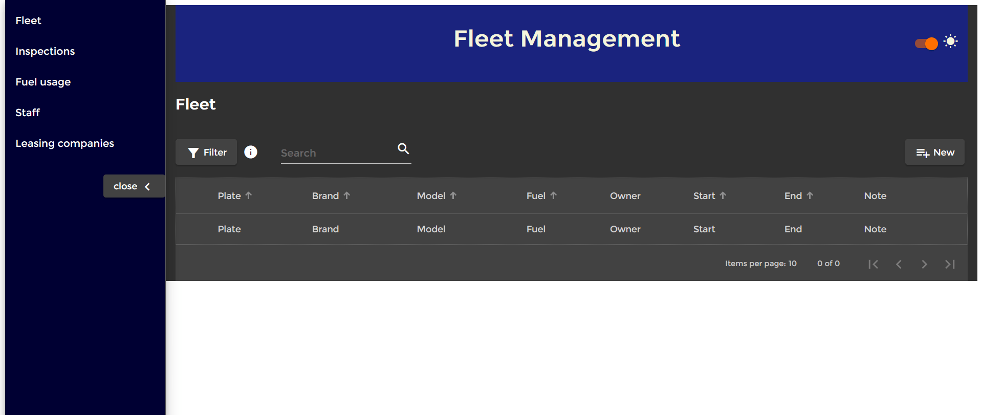
Just adding the CSS classes for light and dark theme and using that HostBinding with a one-liner already works. But it might not be perfect.
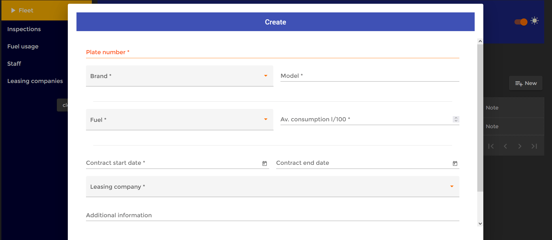
Let’s check how my app looks after this:
Problems with dark theme in Angular Material (and solutions!)
These are the workarounds I found, which work perfectly with the problems I had. I’m not saying they’re the best solution but they did the trick and didn’t break my app, plus I found several alike solutions on the web.
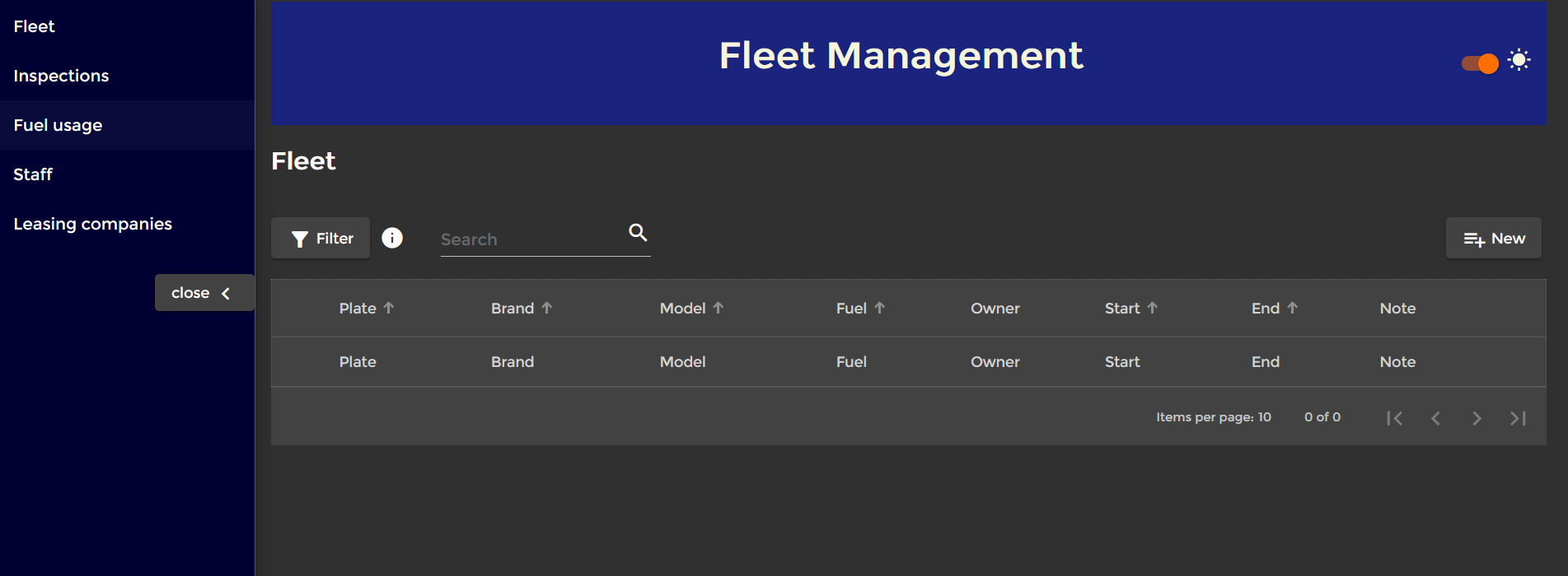
The page background color doesn’t change
First, because I use a side-nav, my content is kind of “floating” above the page background, which doesn’t change color when I switch the theme. Well, in fact, this was already messy because the problem was present with my light theme, but because my background color is really light I hadn’t noticed 😂.
To solve this issue, I used the built-in Renderer2 class. This is again a way to manipulate the DOM, and to my knowledge the only way to be able to manipulate the page CSS properties in an Angular app.
Extend this base class to implement custom rendering. By default, Angular renders a template into DOM. You can use custom rendering to intercept rendering calls, or to render to something other than DOM.
Angular – Renderer2
I have to create CSS classes (still in styles.scss) for the page body background color, which I match with the background color of my dark and light themes:
body.dark {
  background-color: #303030;
}

body.light {
  background-color: #fafafa;
}
And I implement the logic in my app component:
import {HostBinding, Renderer2} from '@angular/core';

export class AppComponent {
  public title = 'Fleet Management';
  public darkModeUI = false;

  constructor(private renderer: Renderer2) {
    this.renderPageBodyColor();
  }

  @HostBinding('class')
  public get themeMode() {
    return this.darkModeUI ? 'dark-theme' : 'light-theme';
  }


  public getDarkThemeOn($event) {
    this.darkModeUI = $event;
    this.renderPageBodyColor();
  }

  private renderPageBodyColor() {
    this.renderer.removeClass(document.body, 'dark');
    this.renderer.removeClass(document.body, 'light');
    this.renderer.addClass(document.body, this.darkModeUI ? 'dark' : 'light');
  }
The renderer is injected in the constructor to be used as a service. Then I created a method with my logic because I have to do it at initialization (because I chose to keep the information stored, so I user who wants to always display the dark theme doesn’t have to slide the toggle each time; otherwise this step is not needed), and it has to be done every time the toggle emits a change.
The current class has to be removed before assigning a new one. To simplify I just remove both class even though only one of them is assigned at first (it prevents me from doing the check of the current class and so on). Then I assign the dark or light class based on the value of my variable.
Mat dialog background became… transparent!
My joy quickly disappeared when I realized that all of a sudden…
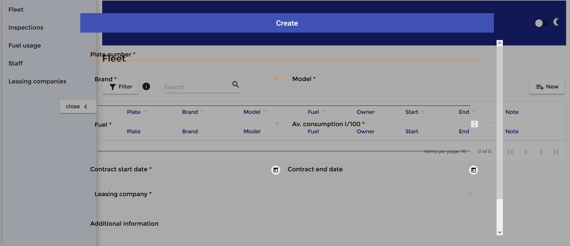
All my dialogs had become transparent! I mean, the background. I went a bit nut on that one, took a nap and found the problem. I wasn’t because of the renderer, it wasn’t because of the host binding, so I could only blame the CSS file.
I didn’t find it on the web but here’s how I think it explains: I created a class for my light theme as well, but then there is no default theming. And for some reason it makes my dialog appear with a transparent background.
So I simply changed my CSS file to:
@include angular-material-theme($fleet-light-theme);

.dark-theme {
  @include angular-material-theme($fleet-dark-theme);
}
Concretely, it makes my light theme applied everywhere by default, then the dark theme applied when the dark-theme class is applied. That’s how I understand it at least.
So far so great…
Until I turn dark theme on again…
Dark theme is not applied to mat dialogs
So here’s the deal: mat dialogs (and probably other floating elements) are part of the “overlay container“. And the elements in the overlay container don’t “inherit” the styles of the app (it’s not a child of the main app). So you just have to apply manually the themes to overlay containers (a bit similar to what was done with the page body).
So I used the built-in OverlayContainer class, still in app component:
The
Angular – OverlayOverlayContainerprovides a handle to the container element in which all individual overlay elements are rendered.
import {HostBinding, Renderer2} from '@angular/core';
import {OverlayContainer} from '@angular/cdk/overlay';

export class AppComponent {
  public title = 'Fleet Management';
  public darkModeUI = false;

  constructor(
     private renderer: Renderer2,
     private overlayContainer: OverlayContainer
  ) {
    this.renderPageBodyColor();
    this.applyThemeToOverlyContainers();
  }

  @HostBinding('class')
  public get themeMode() {
    return this.darkModeUI ? 'dark-theme' : 'light-theme';
  }


  public getDarkThemeOn($event) {
    this.darkModeUI = $event;
    this.renderPageBodyColor();
    this.applyThemeToOverlyContainers();
  }

  private renderPageBodyColor() {
    this.renderer.removeClass(document.body, 'dark');
    this.renderer.removeClass(document.body, 'light');
    this.renderer.addClass(document.body, this.darkModeUI ? 'dark' : 'light');
  }

private applyThemeToOverlyContainers() {
    const overlayContainerClasses = this.overlayContainer.getContainerElement().classList;
    const classesToRemove = Array.from(overlayContainerClasses).filter(item => item.includes('app-theme-'));
    overlayContainerClasses.remove(...classesToRemove);
    this.overlayContainer.getContainerElement().classList.add(this.darkModeUI ? 'dark-theme' : 'light-theme');
  }
For the same reasons as expressed before regarding the renderer, I created a method called at construct and when a change is emitted. I also injected the overlay container to use it as a service. Similarly to renderer, you have to remove existing classes (theme classes this time), and I found a method that does it without explicit mention, although I think using the same logic as with the renderer would perfectly work.
Perfecting dark theme
Everything’s fine now!
A few more things you might consider:
- change the primary/accent/warn colors to make it more harmonious and avoid killing the user’s eyes with crazy contrasts,
- override some properties in the CSS when you applied colors locally: it can be done in the theme class (see next code snippet),
- make a local storage to save the user’s choice, so they will see the dark theme as soon as they open the app if that’s what they chose.
.dark-theme {
  @include angular-material-theme($fleet-dark-theme);
 // overriding some CSS properties when dark theme is on:
  .mat-drawer-inner-container {
    background-color: #000033;
  }
  .mat-table .mat-footer-cell, .mat-table .mat-header-cell {
    color: lightgray !important;
  }
  .warn-discrepancy {
    background: #BF360C !important;
  }
}
I hope this was useful! Drop your comments and questions below, subscribe to receive future articles or follow me on LinkedIn.
My full project will be made available on GitHub as soon as my memoir is done, you can follow me there too for more Angular/TypeScript but also Java/Spring Boot and Python projects.